
Medical / Health & Wellness
Client: Medix CBD Wellness
Scope of Work: Comprehensive Brand Identity, Packaging Design, UX/UI Web Design, Social Media Strategy, Email Marketing, Print Advertising & Studio Photography
Scope of Work: Comprehensive Brand Identity, Packaging Design, UX/UI Web Design, Social Media Strategy, Email Marketing, Print Advertising & Studio Photography
The Challenge
Medix hired me a few years after their initial launch phase, just as the CBD market was becoming crowded. At the time, their line of product packaging looked inconsistent and mismatched, which created visual confusion and mistrust for buyers. They brought me in to fix these branding issues and unify all their product lines under one cohesive design system. Their overall goal was to build fast customer trust through a clean, modern brand centered on personal health and wellness.
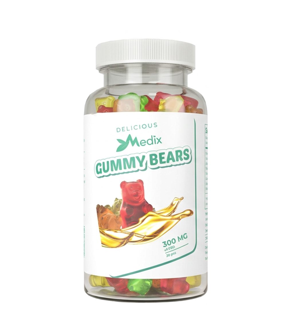
Version Old 1 30 Pk Gummies Label
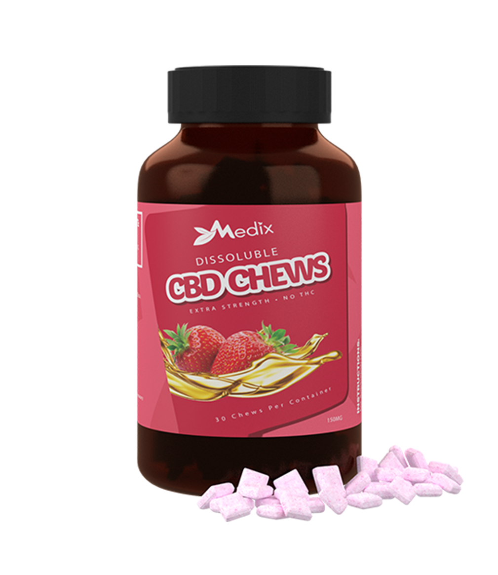
Version 2 Old 30 Pack CBD Chewable Label
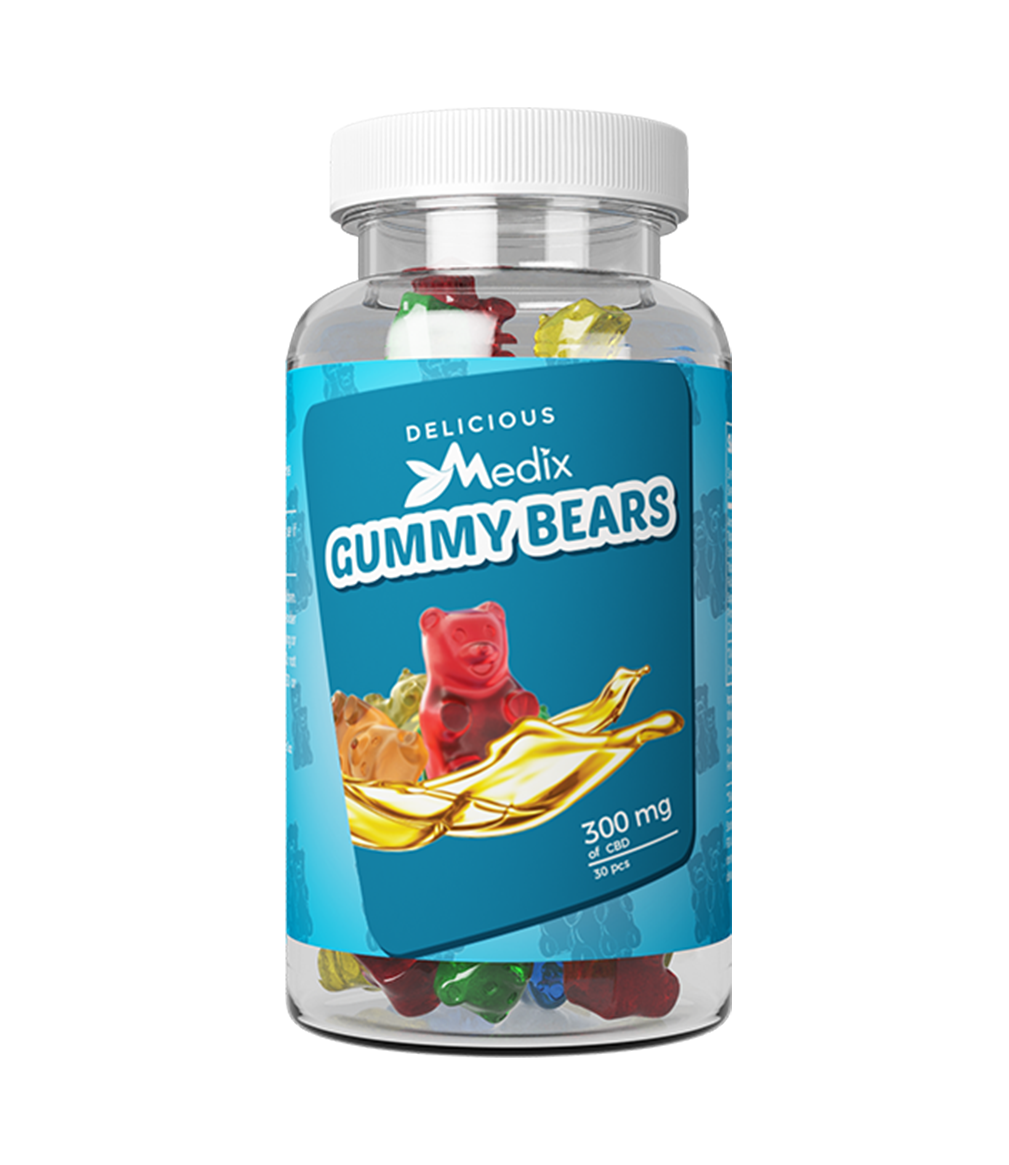
Version 3 Old 30 Pk Gummies Label
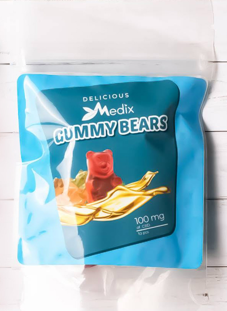
Old 10-pack gummies package
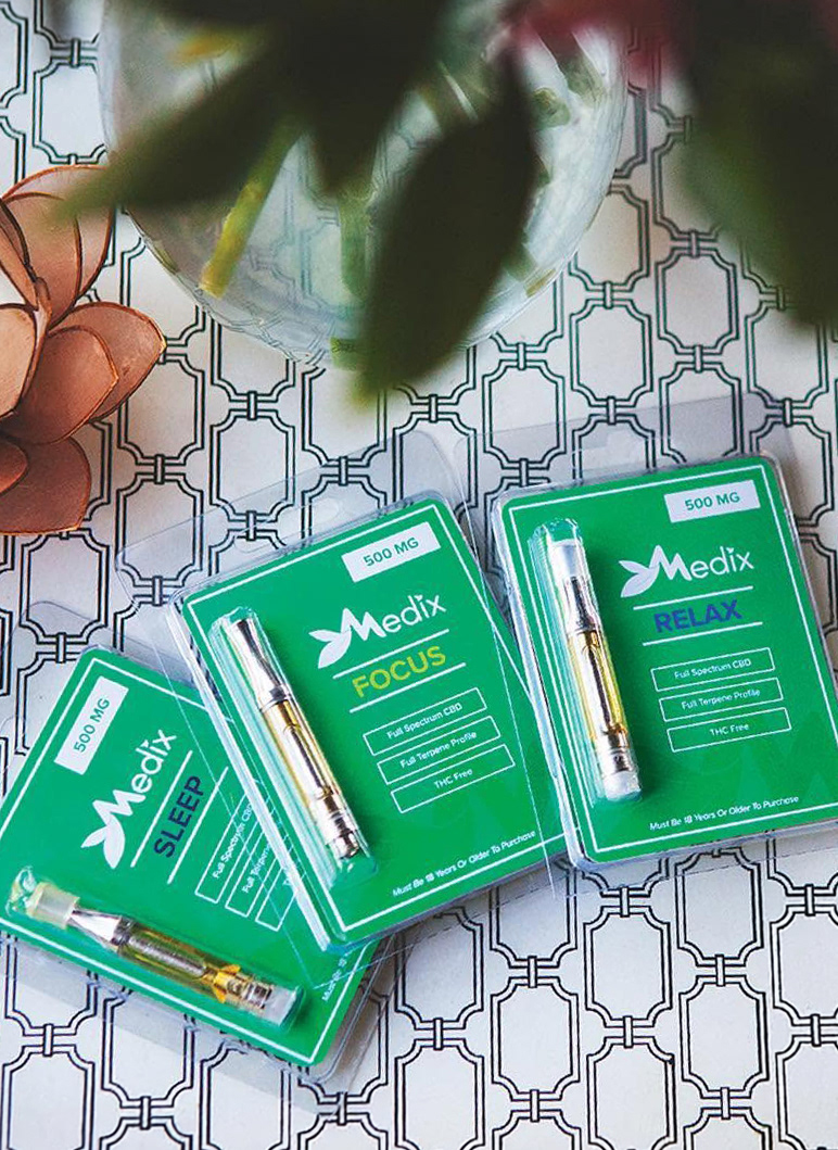
Old vape cartridge packages
The Strategy
To solve this challenge, I unified all Medix products under one consistent look centered around their main green color. I assigned functional accent colors (orange, light green, and blue) to give clear meaning to the specific effect of each product line. I then pulled everything together into a single, cohesive ecosystem by designing a new website, creating email campaigns, producing social media content, and directing all photo shoots in-house.
• Signature green as the anchor color for brand recognition ✓
• Functional accent colors (orange, light green, blue) tied to product effect/purpose ✓
• Applied across website design ✓
• Applied across email marketing templates ✓
• Applied across social media content ✓
• Directed in-house photo shoots ✓
• End goal: clean, trusted presence in the market ✓
• Signature green as the anchor color for brand recognition ✓
• Functional accent colors (orange, light green, blue) tied to product effect/purpose ✓
• Applied across website design ✓
• Applied across email marketing templates ✓
• Applied across social media content ✓
• Directed in-house photo shoots ✓
• End goal: clean, trusted presence in the market ✓

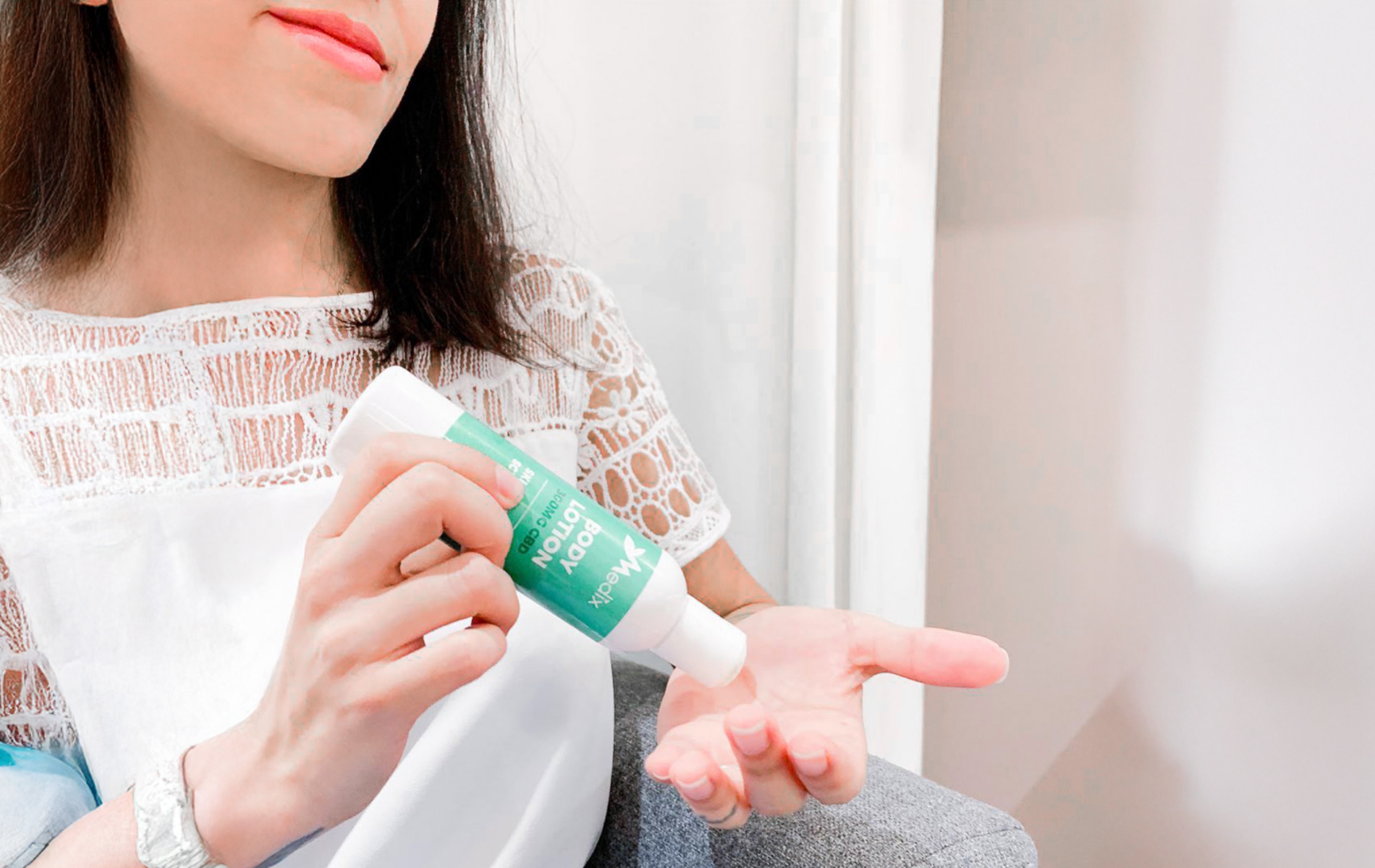
Creams & Body Lotions
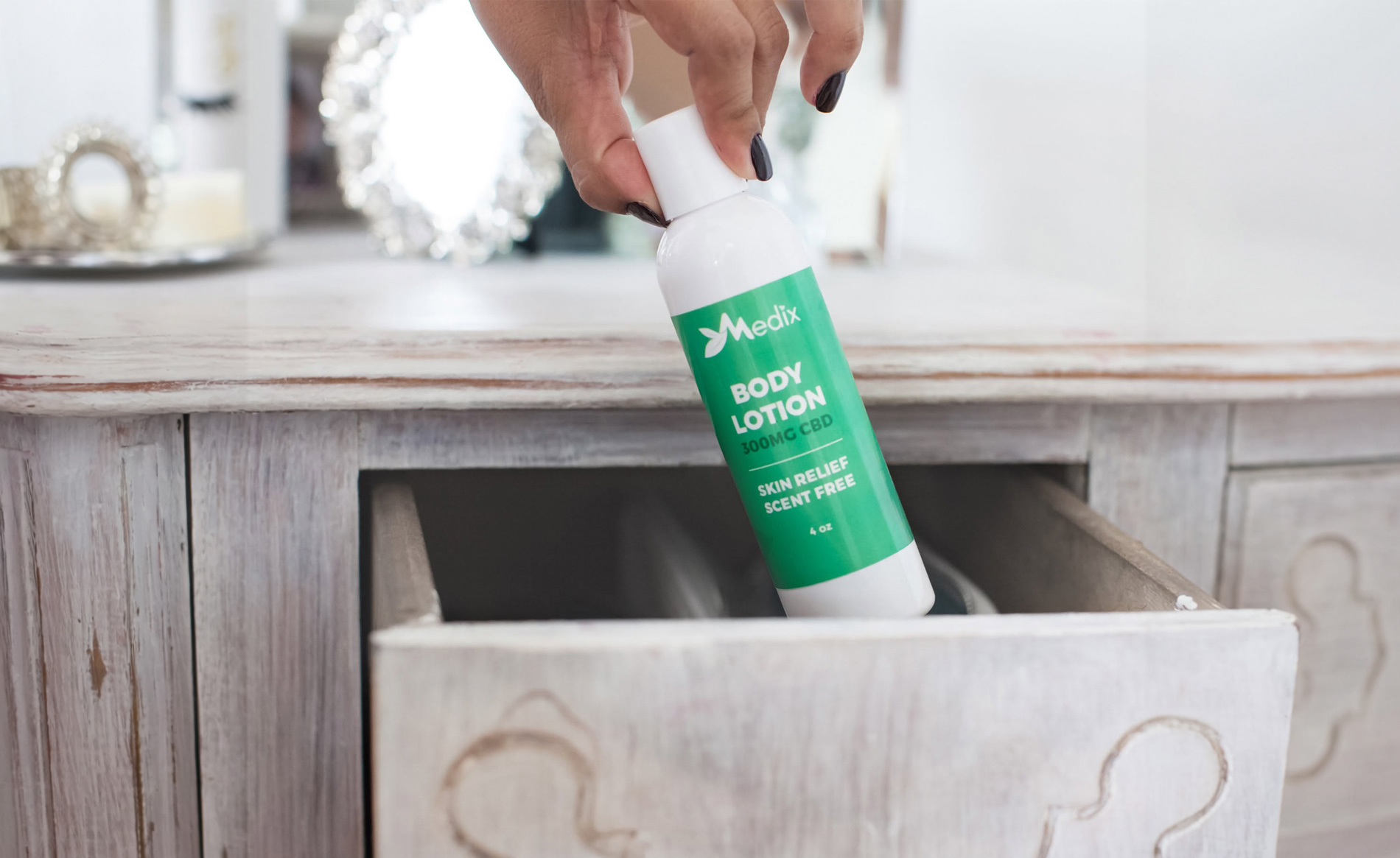
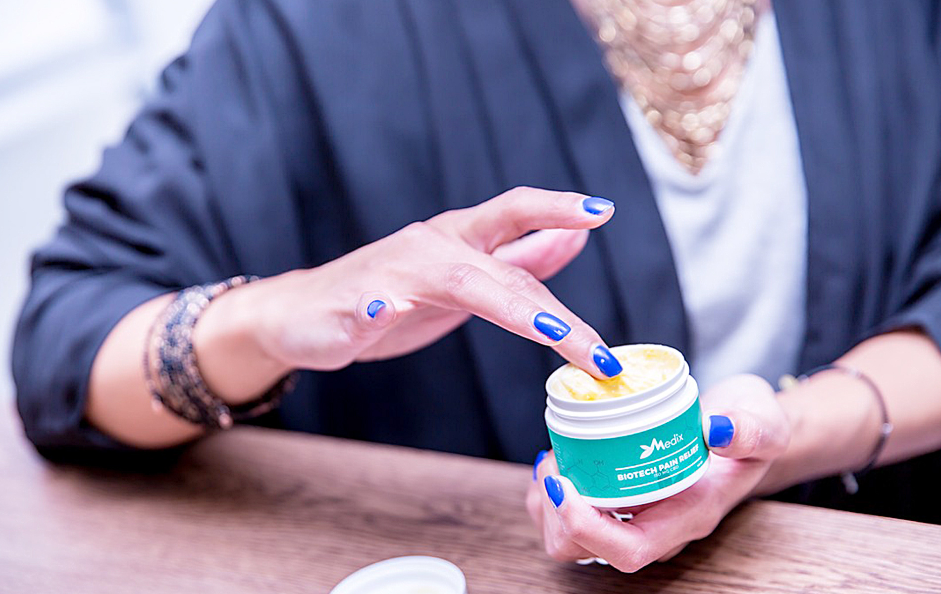
I designed the topical cream and lotion packaging using soft mint green and crisp white. This gentle color palette immediately signals soothing skin care, cleanliness, and health. The bold white text clearly states product benefits like "FAST RELIEF" and "SCENT FREE," making it easy for customers to find the exact relief they need.

Vape Hardware Line
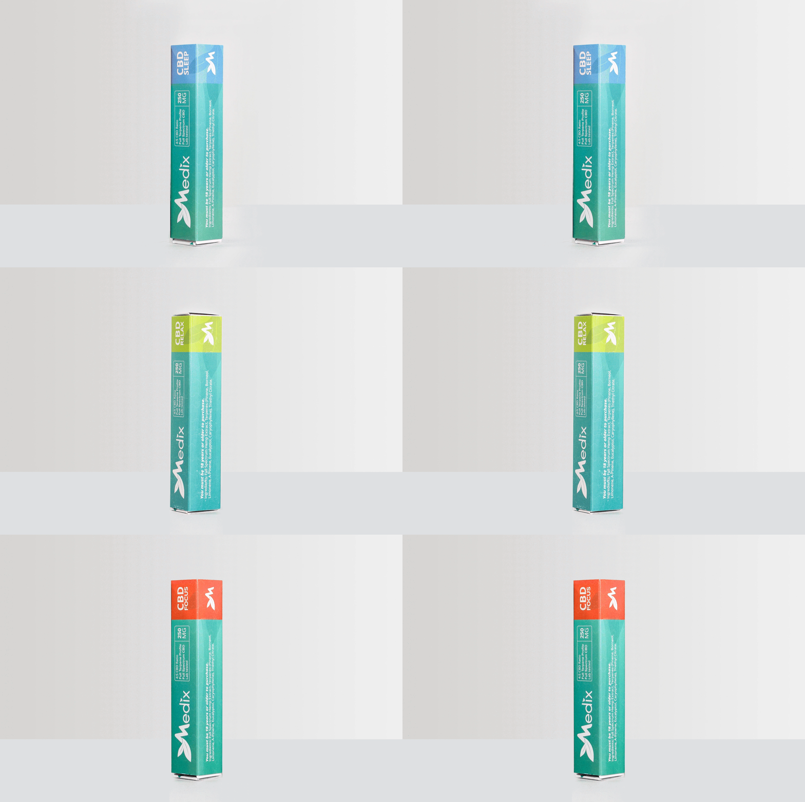
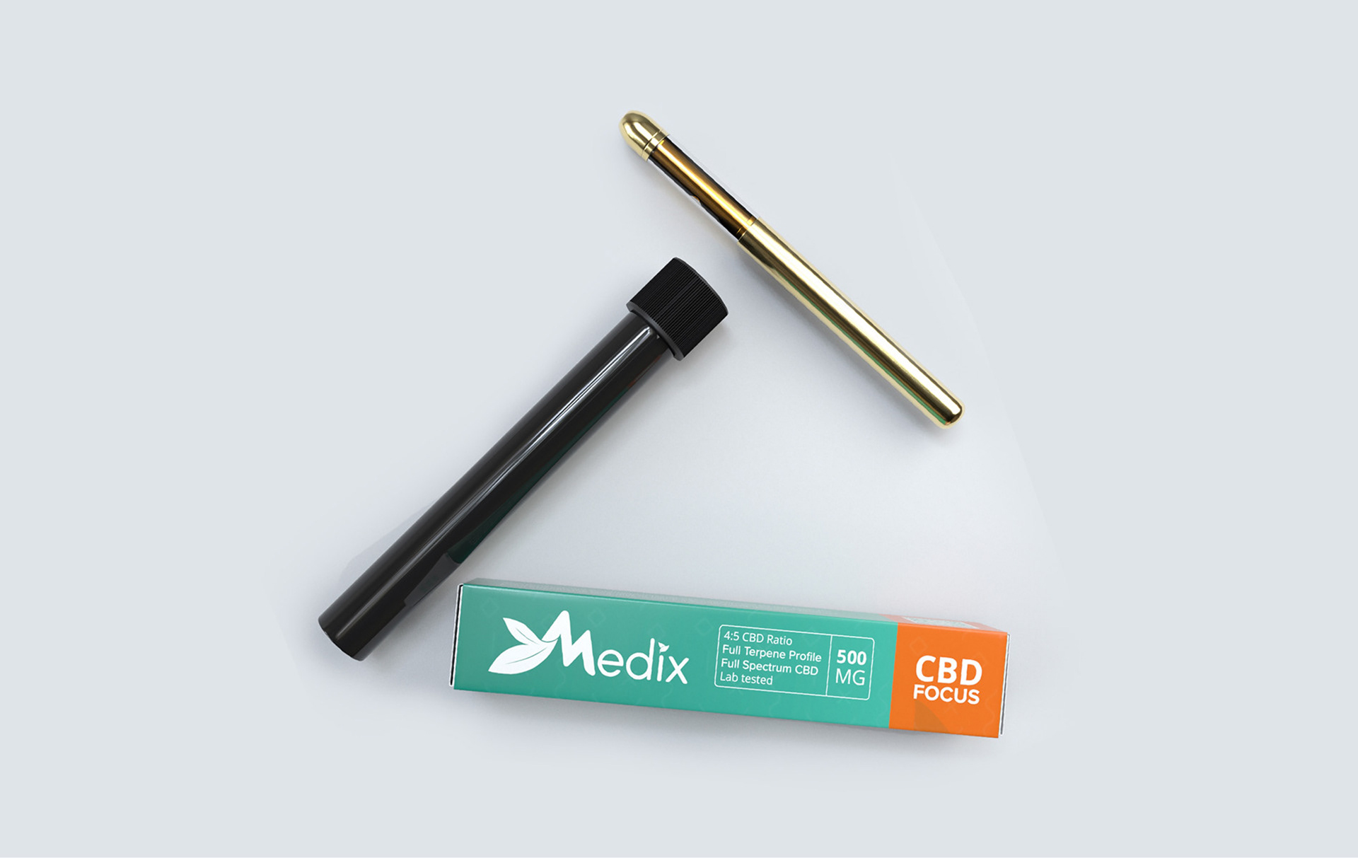
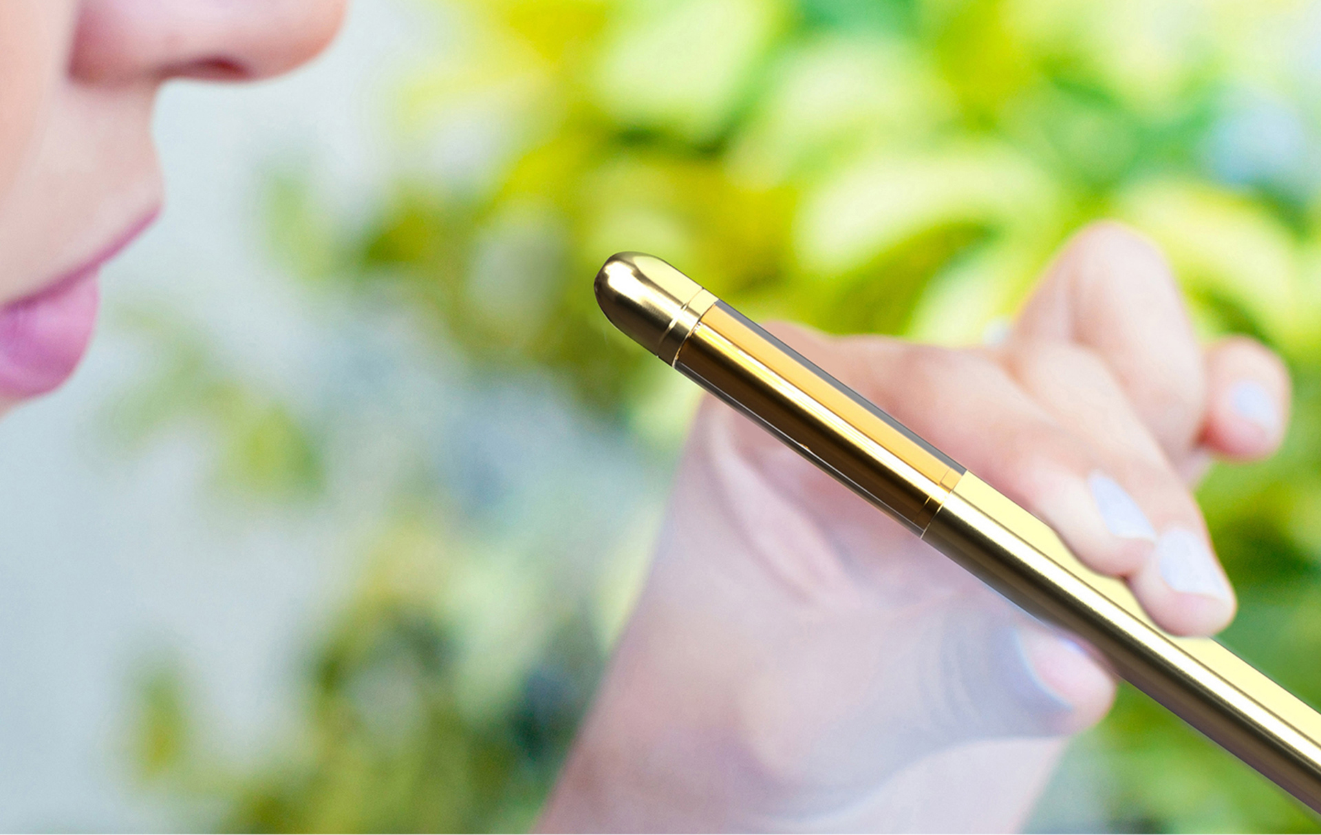
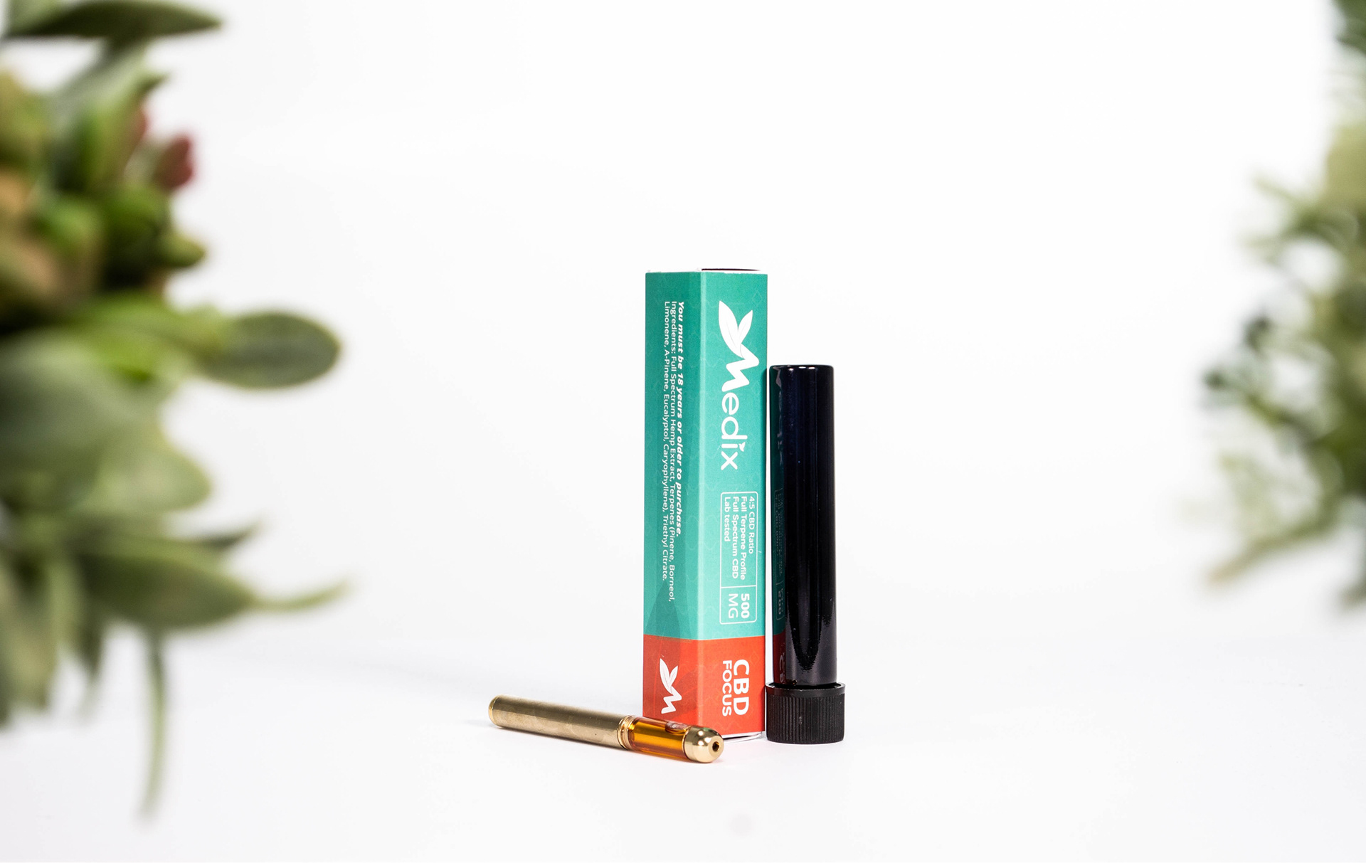
To make the vape hardware stand out, I created a color-coded packaging using bright accents light green for Relax, warm coral for Focus, and sky blue for Sleep. Pairing these colorful boxes with gold hardware and sleek black cases gives the line a high-end, premium feel that appeals to active lifestyle users.

New 10-Pack Gummy Line & Retail Displays
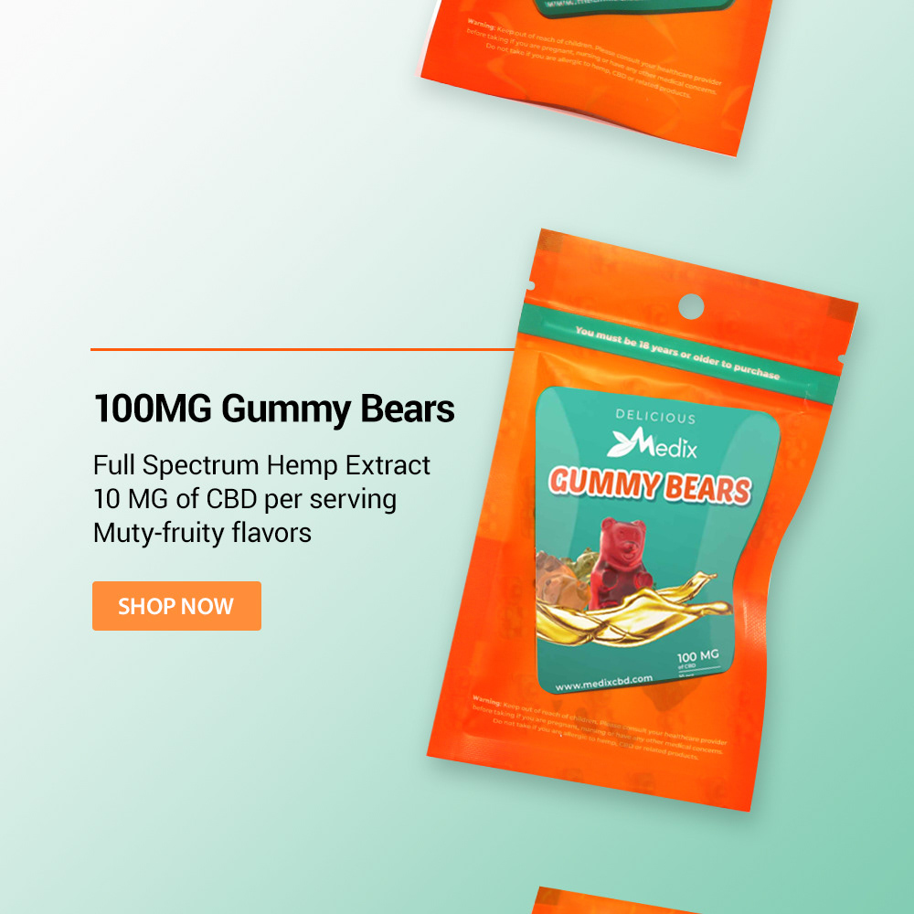
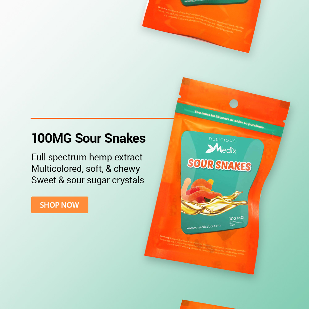
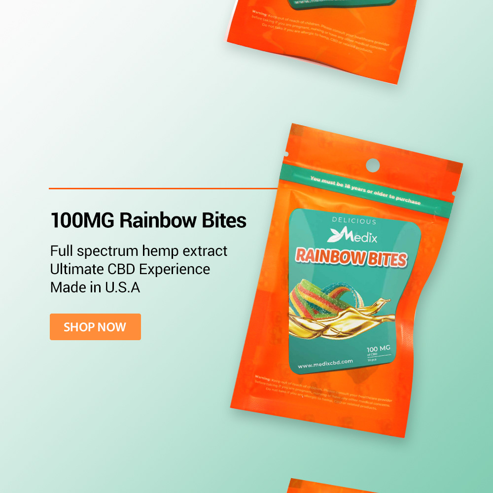
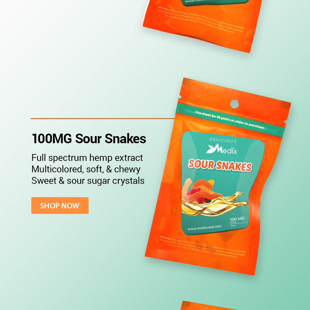
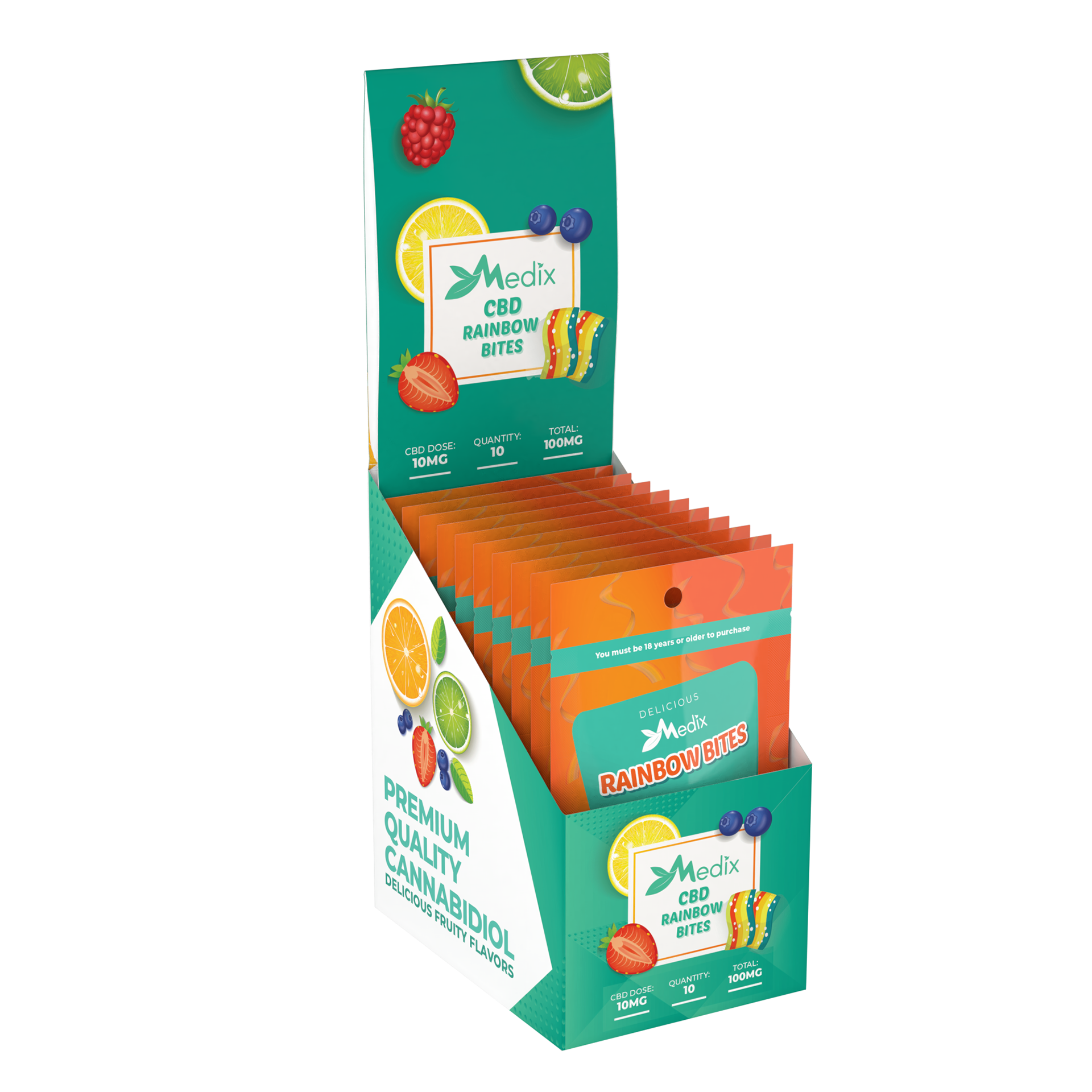
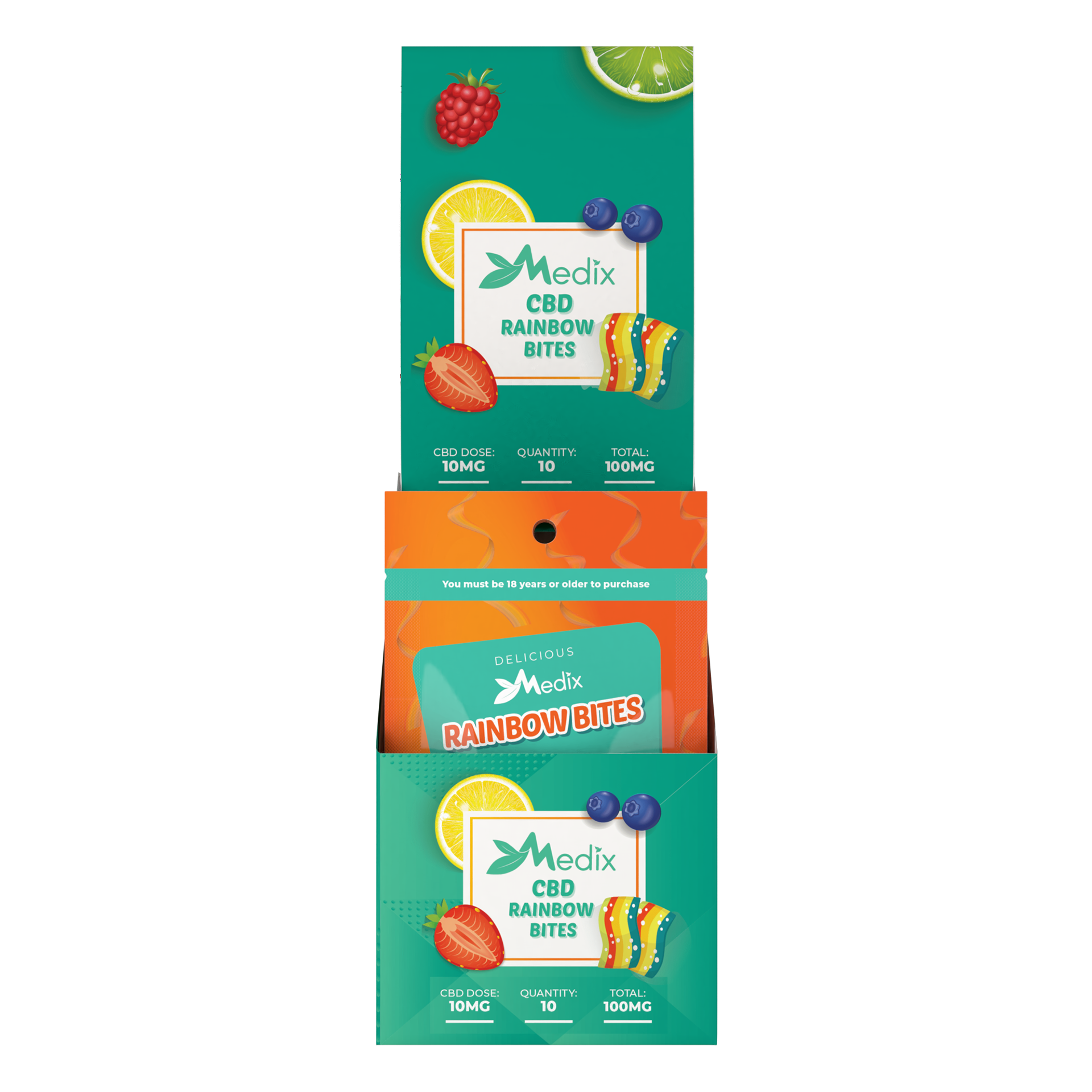
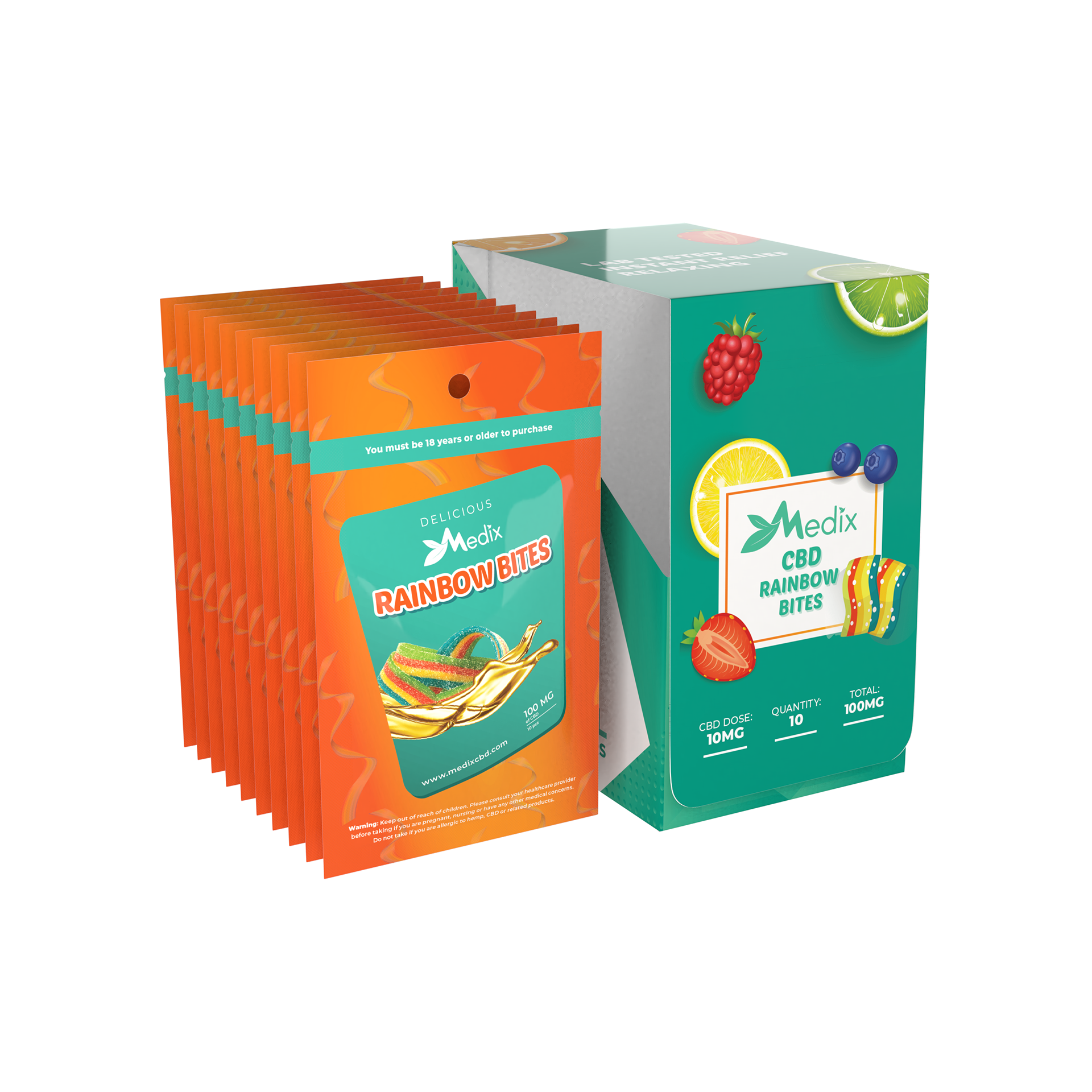
I designed a compact 10-pack pouch series with matching point-of-sale display boxes for retail counters, built to drive impulse purchases at checkout while staying clean, organized, and easy for store owners to stack. The packaging used Medix's signature teal-green paired with a vibrant orange header strip, creating a high-contrast look that stood out and built instant brand recognition across retail shelves. Colorful fruit illustrations, including orange, lime, strawberry, and blueberry, made the products feel fresh and appetizing.
30-Pack Gummy Bottle Line & Flavor Consistency
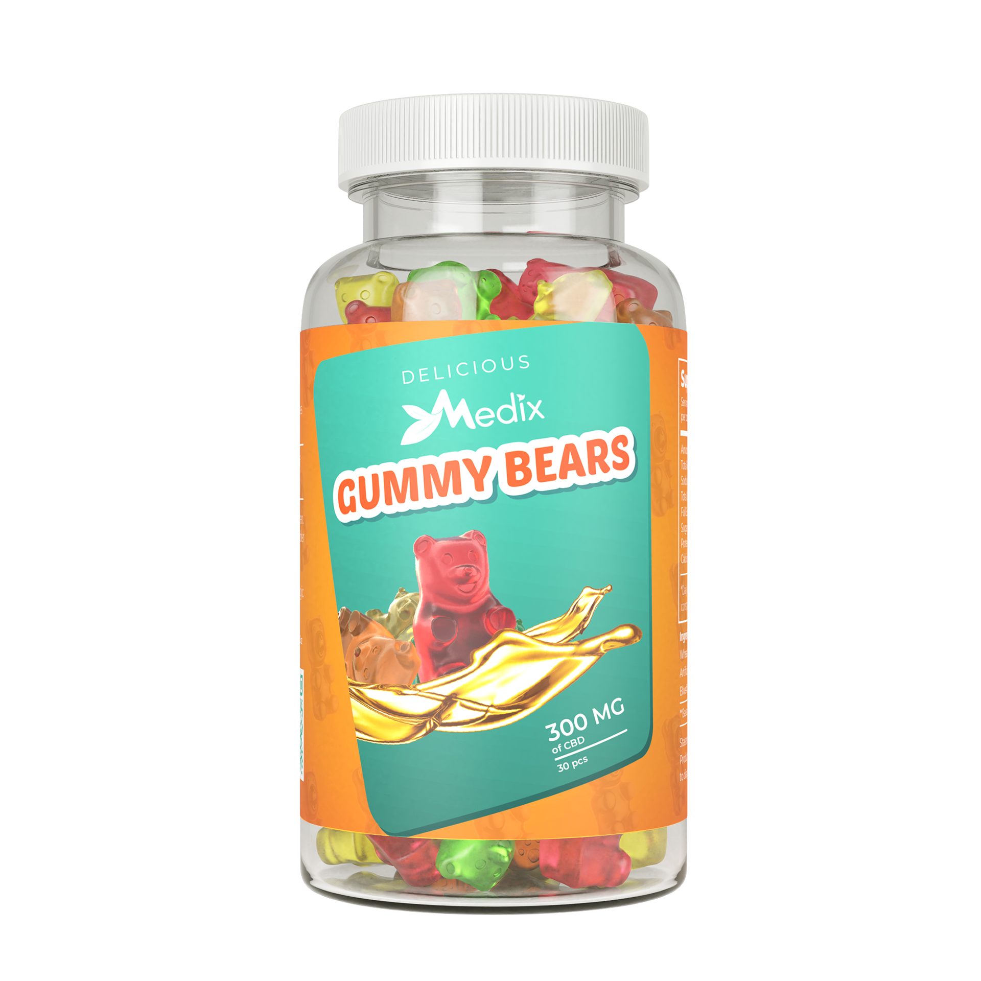
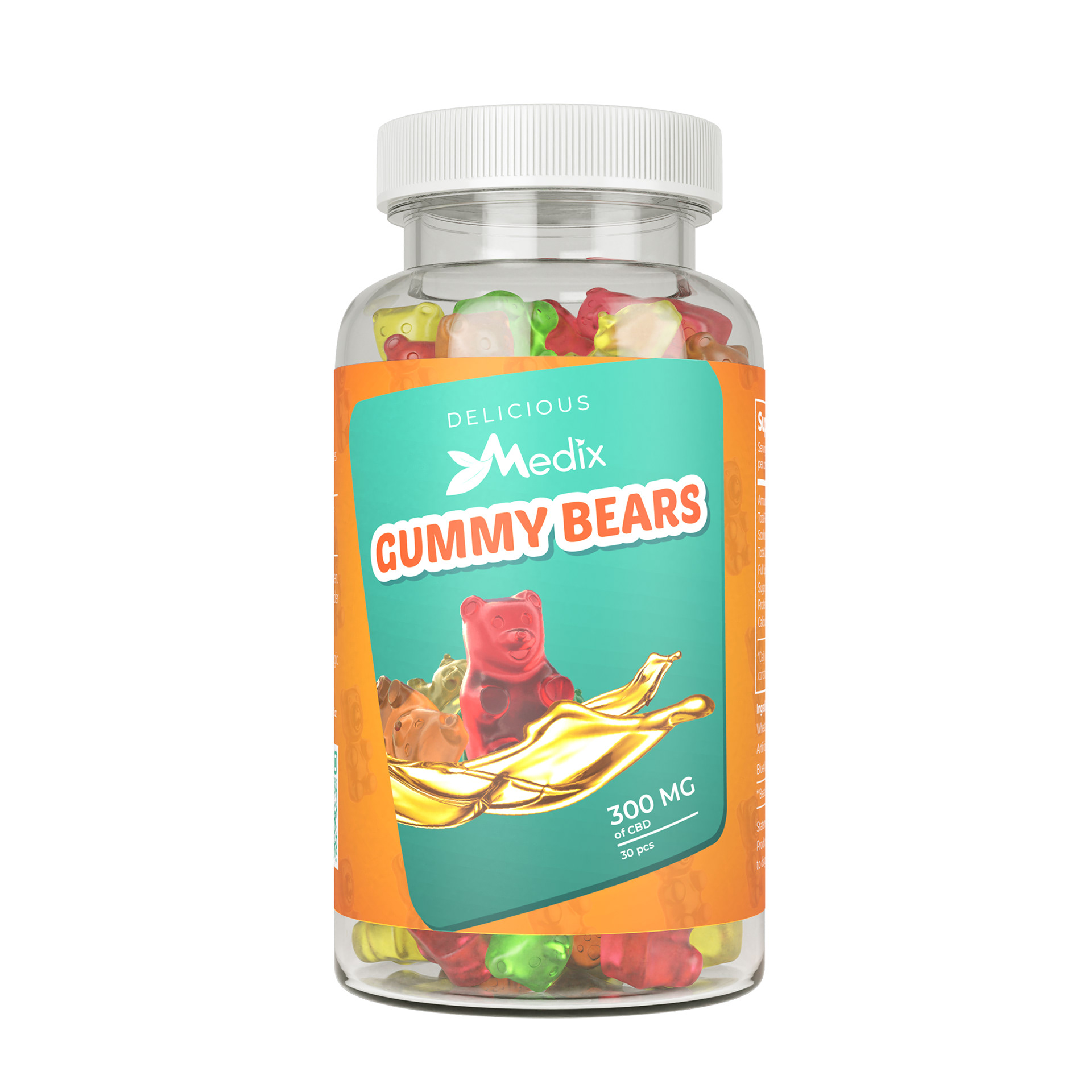
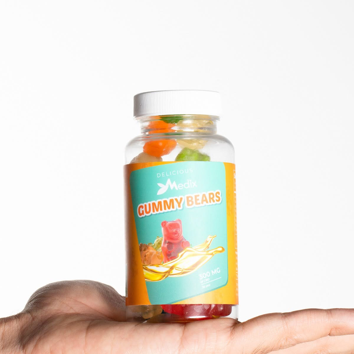
I kept the 30-pack gummy line clean and consistent with one label layout across all four flavors. Every clear bottle has Medix's teal-green banner on a bright orange background. This makes the brand easy to spot on the shelf.
The product name sits in bold, focus-orange text with a white border inside the green banner. At the bottom, a golden splash graphic represents the full-spectrum CBD oil infused into each gummy while clearly showing the 300 MG strength. Every bottle uses the same layout, but different fruit and candy graphics make each flavor easy to tell apart.
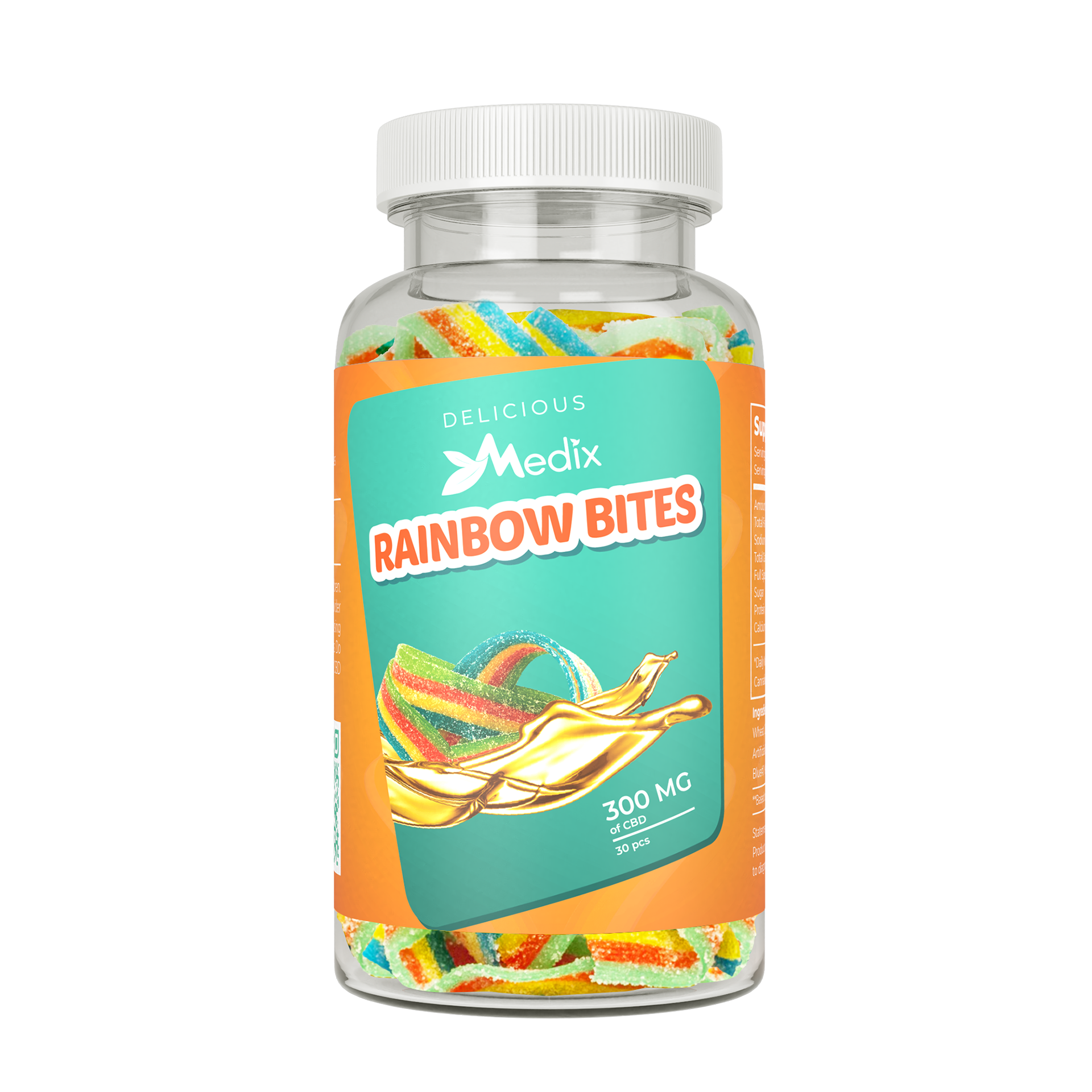
Features dynamic rainbow candy visuals to highlight the multi-flavor chew experience.
Uses a classic red bear graphic over a golden splash to represent the traditional gummy style.
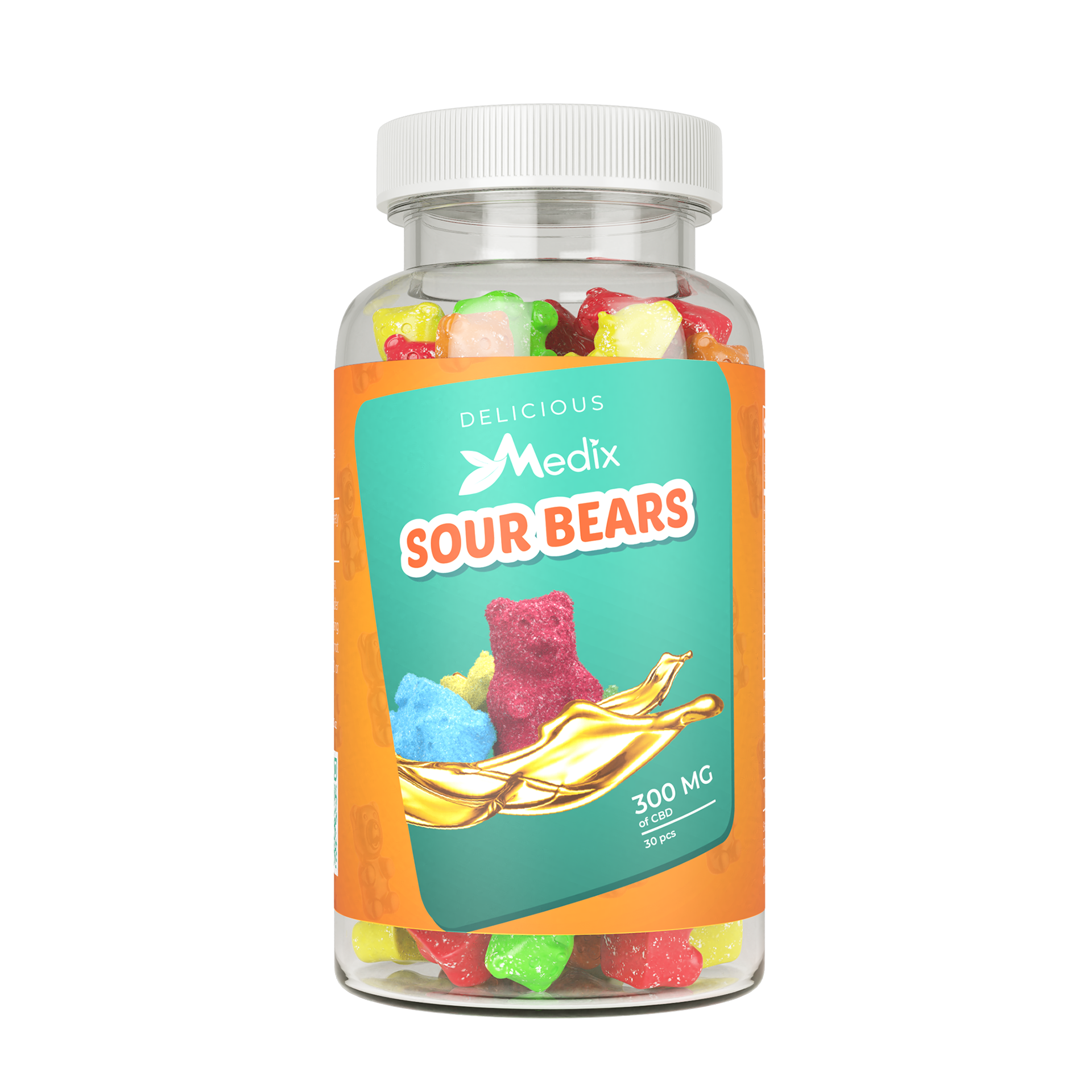
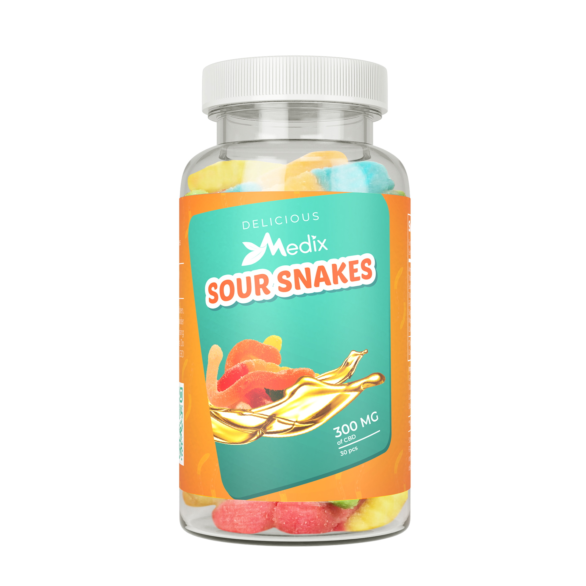
Showcases sugar-coated bear to quickly communicate the tangy, sour flavor profile.
Label displays coiled sour worm visuals to make the fun shape and tart taste stand out clearly.
Retail Display & Box Messaging
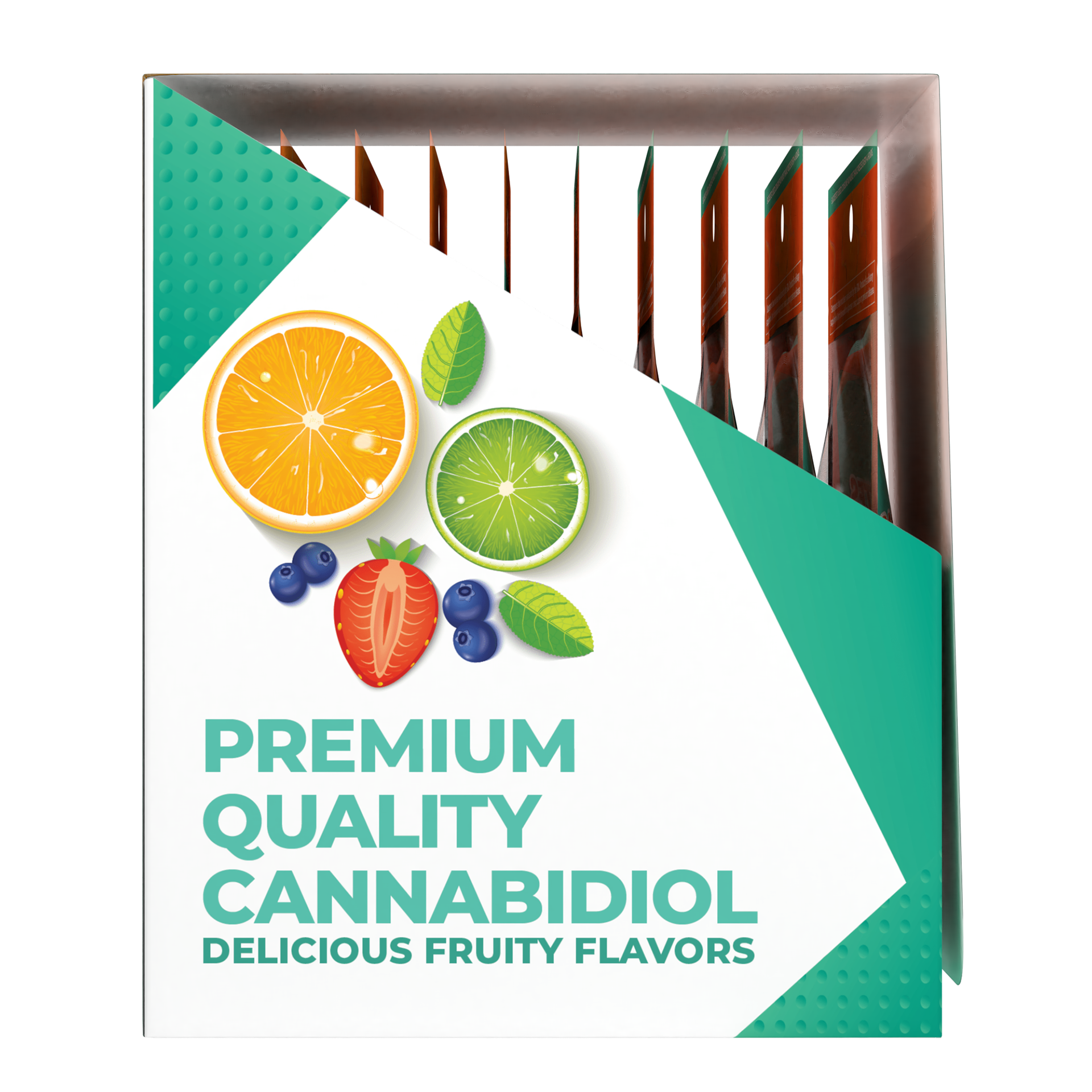
The custom display box held ten individual packs neatly in a vertical row, with crisp white side panels and bold teal text reading "PREMIUM QUALITY CANNABIDIOL" and "DELICIOUS FRUITY FLAVORS." This let customers understand the product quality at a glance while keeping the retail layout clear and functional.
Marketing & Digital Touchpoints
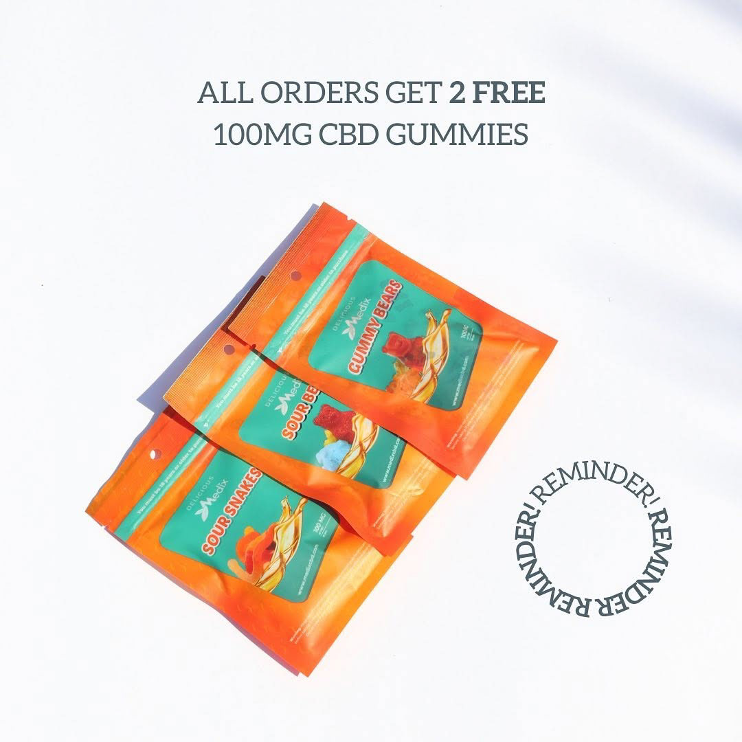
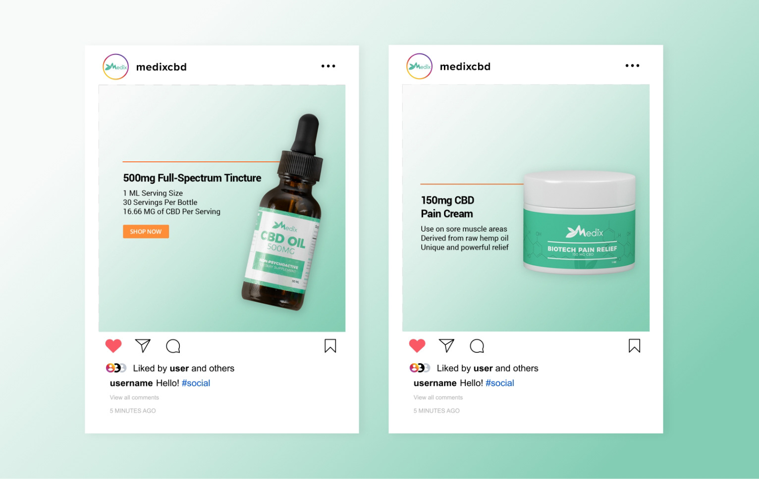
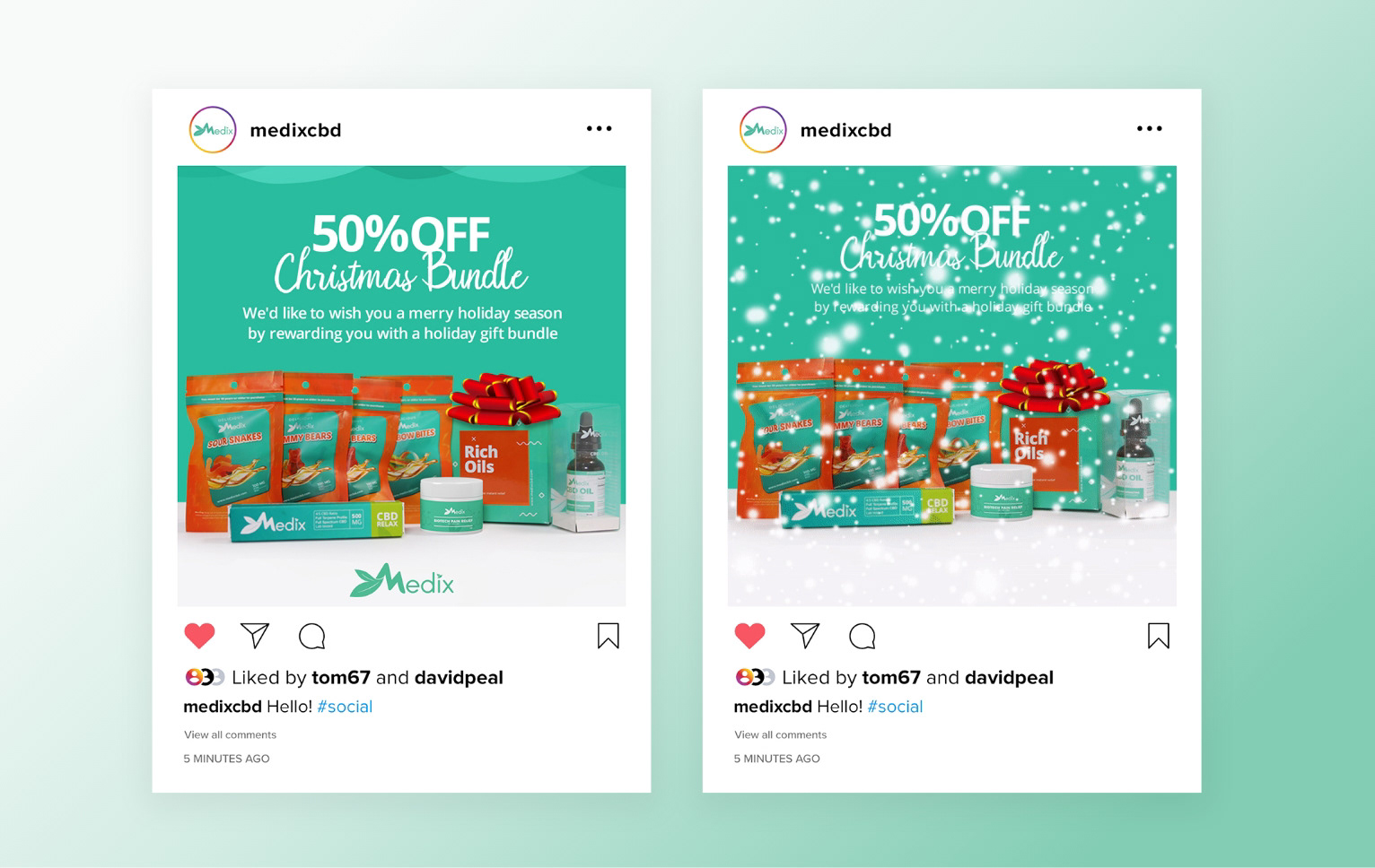
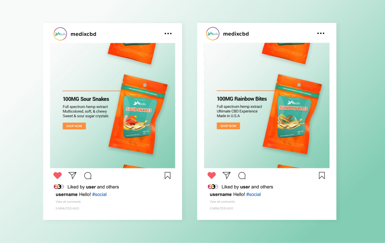
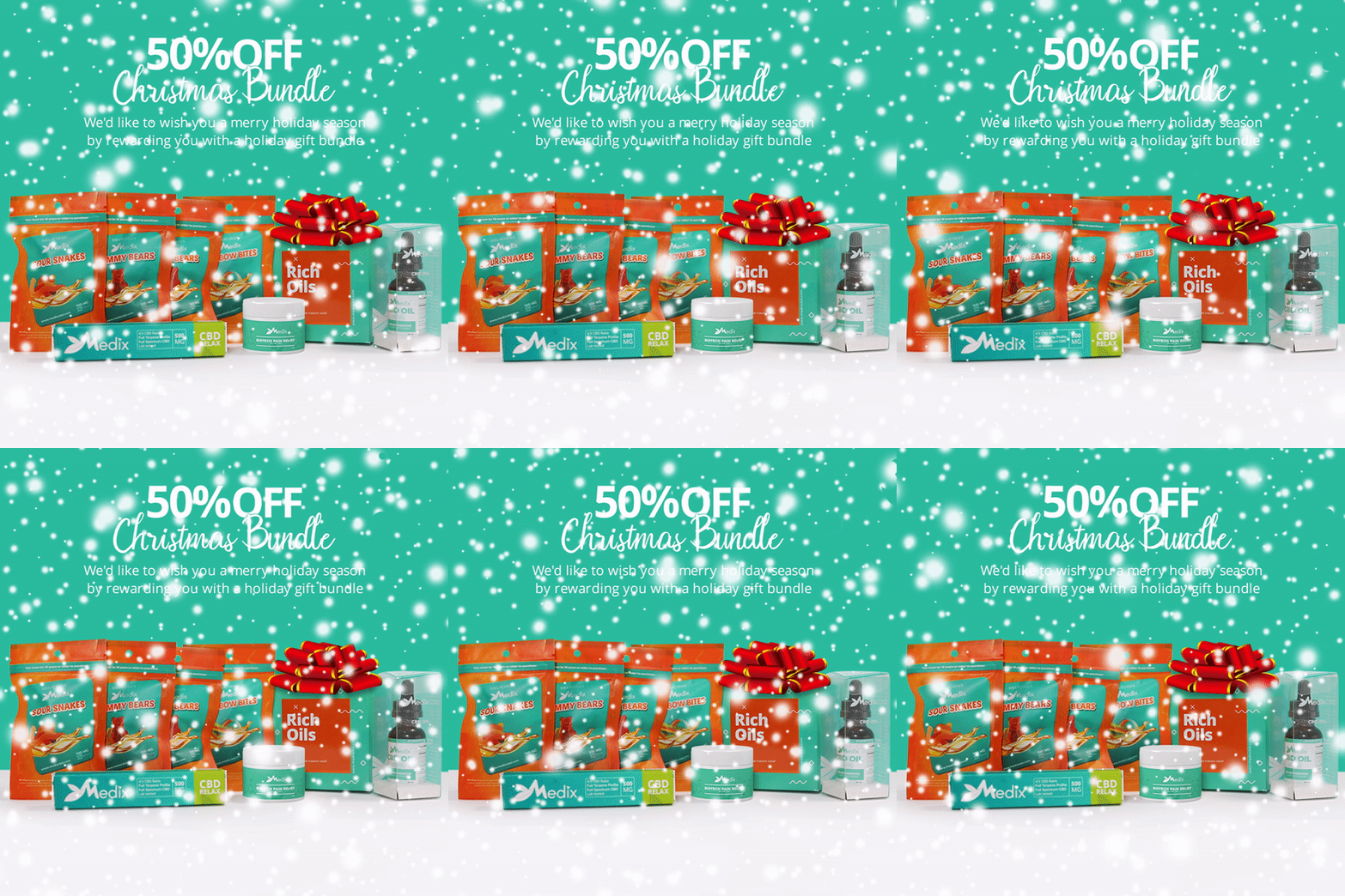
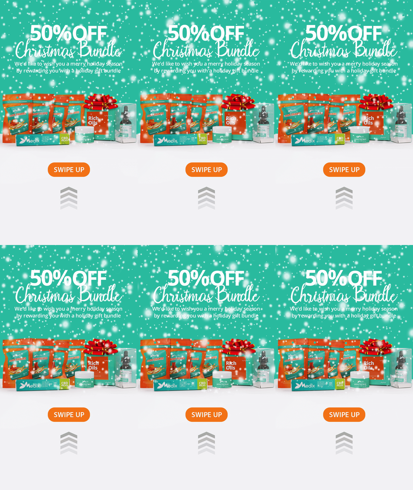
Social Media Campaigns: I created a product-driven social media content using bright color blocks, clean photography, and clear messaging to keep the online feed active and trustworthy.
Email Marketing Templates
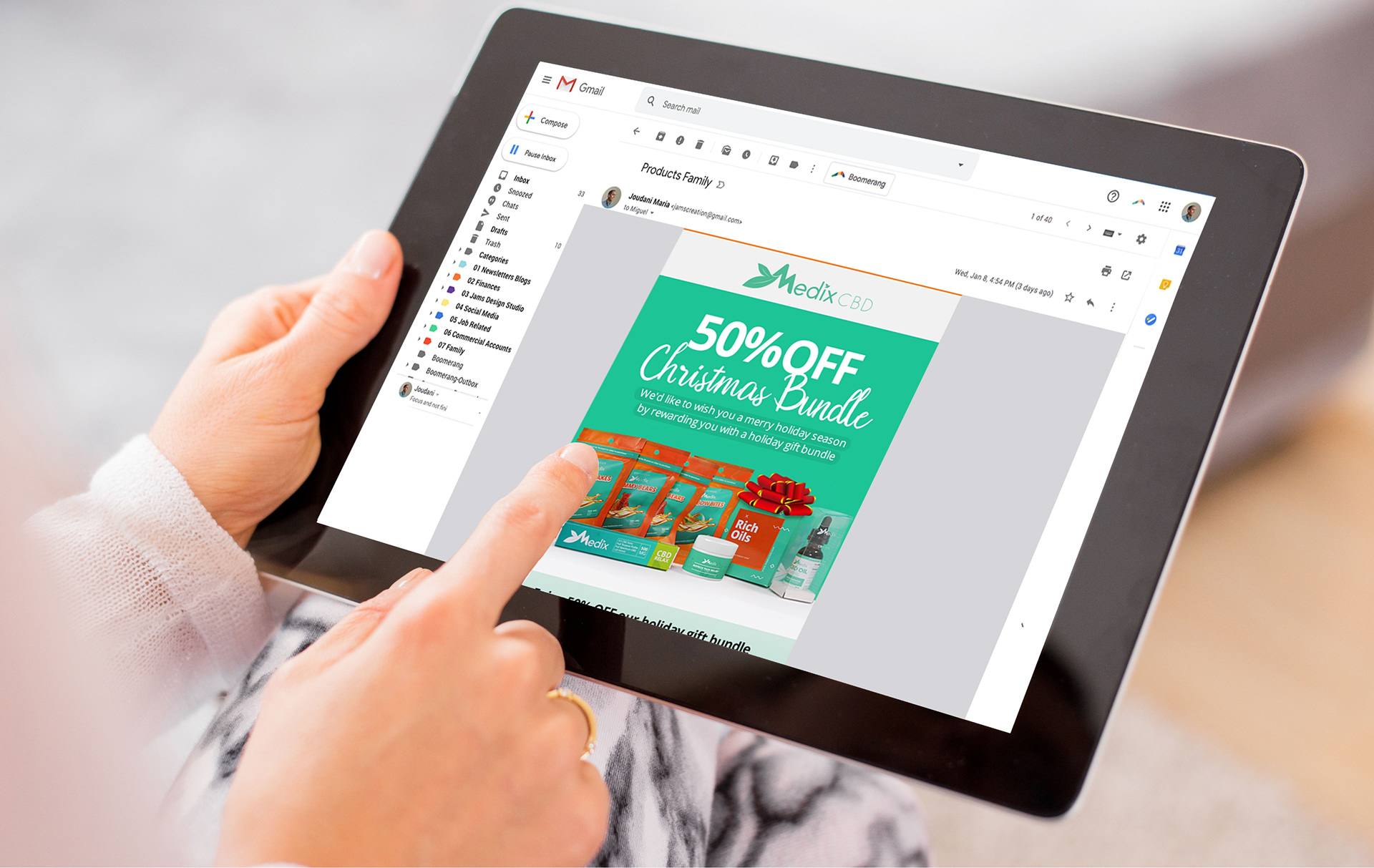
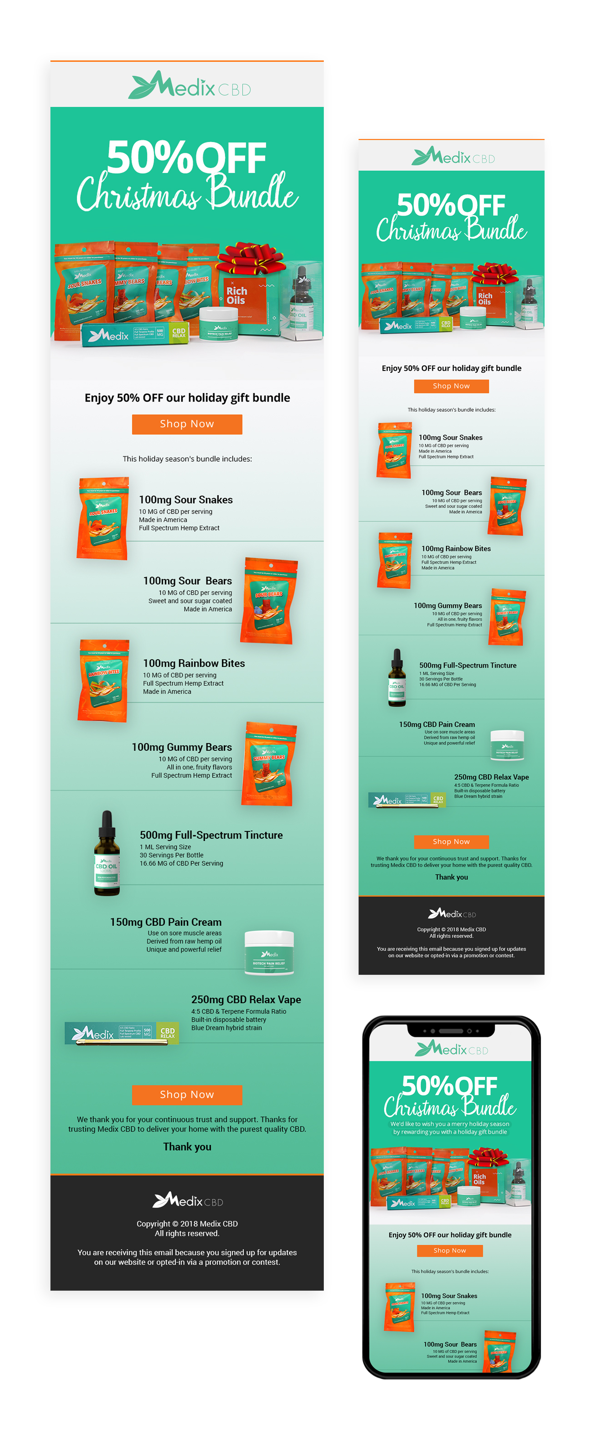
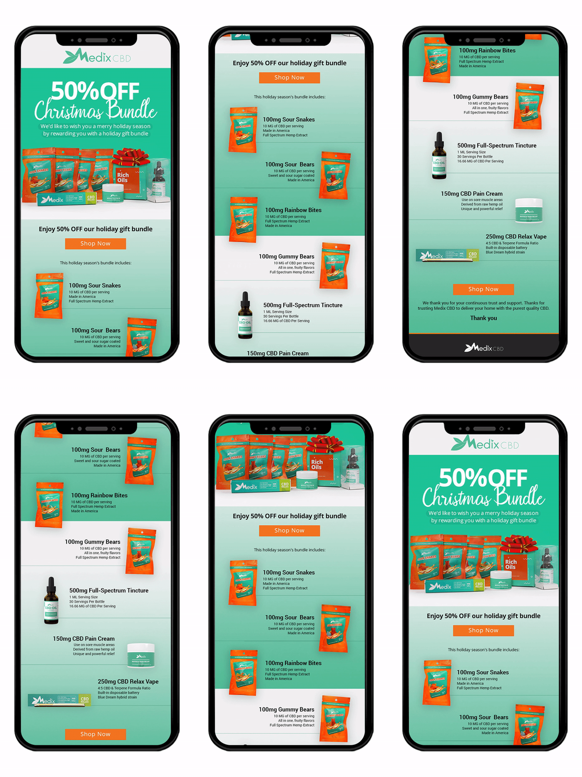
Email Marketing Templates: I set up simple email layouts with bold headlines and direct buttons, ensuring every automated newsletter felt clean, easy to read, and aligned with the brand look.

Magazine Print Ads & Studio Photography
I directed studio photo shoots to highlight the pet product line and designed full-page print ads using Adobe tools to showcase products in bright, natural settings.
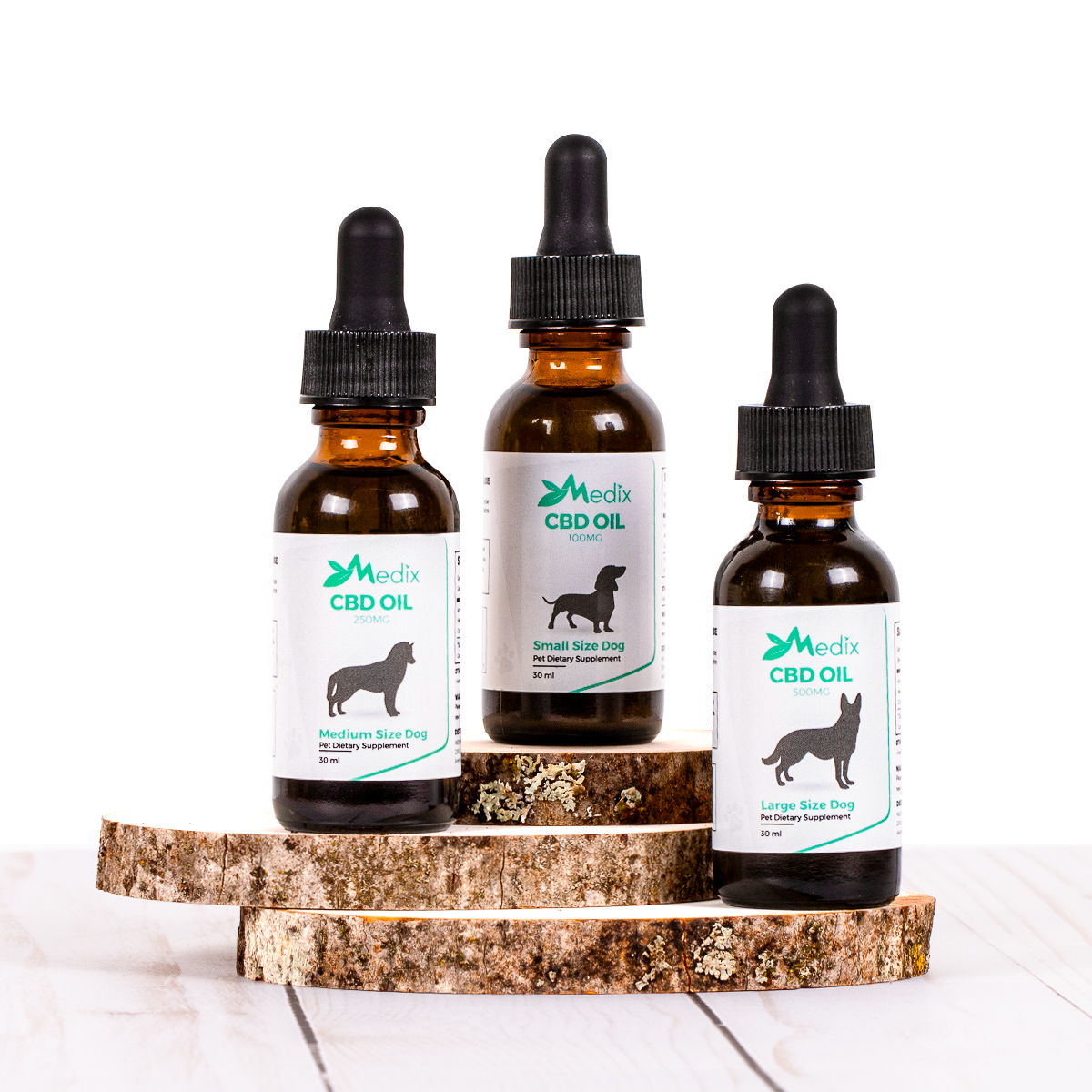
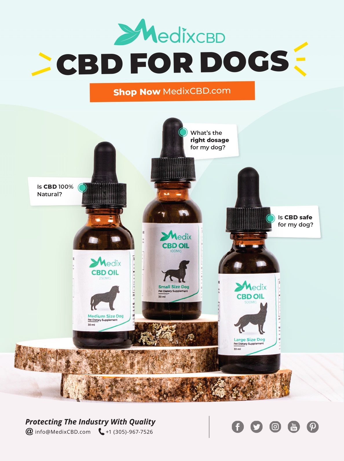
Left: Product captured in a raw studio image. On the right is the finished composition, created with Adobe InDesign.
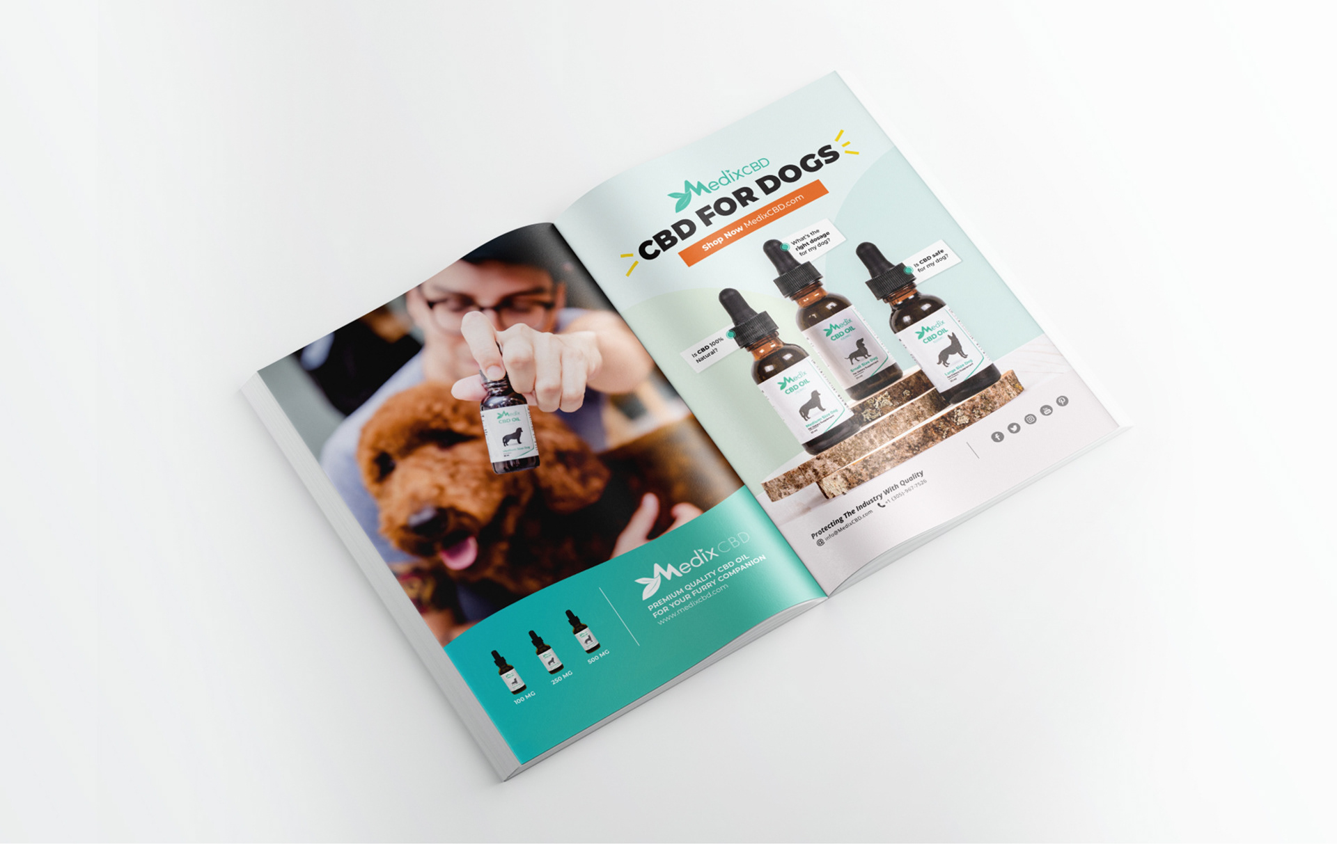
These ads were features in national publications, including Modern Dog Magazine, expanding broader market authority.

The Result
The holistic brand transformation delivered undeniable commercial outcomes, proving the measurable ROI of intentional design. As documented in, the unified creative assets
Revenue Growth: Helped generate steady, predictable monthly revenue between $30,000 and $40,000.
Brand Authority: Increased customer recognition across online storefronts and print media.
Business Equity: Built strong visual value that played a key role in positioning the company for a successful $1.5 million sale in 2021.
Check out my work, learn more about me if you are ready to take your brand to the next level, contact me today.
Thank you for your time.